
Nine Tips to Create Banners for Profitable Advertising
This a guest contribution from full time affiliate marketer, Nrupen Masram.
Some people think that banner ads are coming to an end. The problem is most of us use banners in way as they were used in 1994-2003.
As time passes, the industry changes and so does the use of banners in marketing plans. However, banner advertising is a flourishing billion dollar industry that pervades advertising, teaching, publishing and every other information marketing industry you could name.
The end of banner advertising is a fallacy.
If you’re planning to spend money on banner ads, here are a few tips to think about before you get inside and play dirty:
1. Size does matter
Three shapes dominate. Boxes, stripes and skyscrapers and they vary in size.
Banners with long height and small width are known as skyscraper banners while stripe banners are small in height with a relatively large width. Box banners were named because they were traditionally placed inside software and CD boxes, and because of their square shape.
However, not all sizes offer the same conversion rates.
Since most screens are limited to 600px in height, banners with more than 600px height will make people scroll, reducing the likelihood of conversion. Banners with width lesser than 120px will hardly appear and banners with more width than 160px might overtake your sidebar’s most important task of navigation.
2. Banner Placement
It is generally understood that if your banner is placed in a visible section of a site such as a side bar or above the fold, it will be clicked more often.
If you use a skyscraper banner, place it in your sidebar for better conversions. Striped banners are better placed above content, below a video product review or on the side of the site header.
The key is to put your banner where people will see it and feel motivated to act.
3. Woman Power
Marketing experiments firms and labs have proven that using a beautiful woman on any banner attracts much more attention than using a man. Some tests show a man’s image might be more relevant but when woman was also introduced in same banner along with man provided much better results.
Sometimes you don’t even need female images. Wording also works well. For example, “Mom of Four Earns $ 7,438.12 in One Week” is likely to do better than “Broke Dad made $ 12,976.45 in 7 days.”
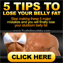
The example image is from Mike Geary’s product Truth About Abs. After testing banners Mike found a banner with a female torso performed much better than other banners. In current set of affiliate tools of TAA, most banners features female torso in front of a man.
Coincidence? I don’t think so. Mike is one of the best when it comes to provide highly tested affiliate tools, that’s the reason why he runs a multimillion dollar info-product business.
4. Authority Works Even Better Than Woman Power
Have you seen the banners on the sidebar of the Problogger.net? There isn’t a lot of emotional pull. Nor is there a call to action. However, I am sure they might be the most successful banners on ProBlogger.
The reason is obvious. This is the most popular blogging for income blog in the world. Darren’s blog has set a benchmark in blogging industry and these same types of banners will work equally well when used the right way on other sites.
The reason is that every one of them have the ProBlogger logo which tells you that ProBlogger either owns the product or certifies it. A site logo will grant instant authority and credibility for people wanting to build a successful blogging business.
Authority works well for these banners. The name instils trust and a proven track record for success.
5. Copy is King
No banner is finished without the copy. Copy is, and always will be, the king of conversions. You can’t change that indisputable fact.
Copywriters rule the roost in email, video and content marketing, the creation of sales pages and other forms of paid advertising and traffic strategies. While it may sound harsh, it’s a fact you can’t alter.
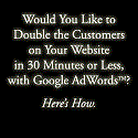
Unless you have powerful click-triggering copy, any trick you might consider using, including the authority one, simply won’t work. The sample banner is among the best dating niche banners in terms of performance. It’s intelligent copywriting because it makes you click without resorting to a call to action.
6. An Obvious Call To Action (CTA)
Use of “Click Here” might work well if your copy have curiosity element but if not, you can definitely come up with a most motivating reason to act. If you have hired a copywriter to do a banner copy, ask them what they can recommend as your CTA.
7. The CTA Color.
Crazy Egg has done considerable research into this topic. If your CTA buttons use red, green, orange, blue or yellow, they’ll have far greater success than other colors.
There’s a scientific reason for this. These colors have the longest wavelengths, which means they attract more attention, thereby leading to extra sales. So it’s not coincidental that most CTA buttons you see anywhere use one or more of these influential colors.
Following are some really good performing banners of different products from ClickBank. Have a close look on their size, copy, CTA and color.
8. What is Traffic Monetization?
Traffic Monetization says, “the nature of traffic is always dependent on the sources of traffic.”
You can’t use the same landing pages to convert all types of traffic. Why? Because just as traffic sources are all different, so are their responses. This same rule applies to all banner ad traffic.
Your marketing can be divided into two sections; Front End and Back End Marketing. The Front End aims to put your offer in front of your client and to get them inside your sales funnel. Once they are there, the Back End makes the actual sale.
The majority of landing pages are only optimized for affiliate sales but not for traffic from banner ads. If you get traffic through from your banner ad, use product specific squeeze page to nudge them into your sales funnel and then make the sale.
9. Rules that Apply to Paid Traffic also Apply to Banner Ads
Paid traffic source should be constantly split tested, customized and optimized. You also have to use specific methods to work out on your metrics and your return on investment (ROI).
There are free and paid tools that you can use for testing and they can also reveal what banner was loaded, the page that a click triggered and the different traffic paths that people took to get to the conversion page.
Kiss Metrics is a high-end tool used by the marketers to find every minute detail to enable them to improve their traffic monetization strategies.
Example Of Sites That Are Successfully Using Banner Ads
IncomeDiary.com is one of the most successful site with banner ads. They spend lot of time optimizing and tweaking banners for max performance because almost all products that they promote on their website belong to them. Stripe Banner is placed above content; one 250 x 250 banner is placed on sidebar above fold. Rest banners are also 250 x 250 banner.
JohnChow.com and ZacJohnson.com also place stripe ads above blog content. ZacJohnson.com uses 250 x 250 flash banner on sidebar above fold whereas JohnChow.com uses 250 x 250 banner in content.
Other Things To Consider
The first time ads were used, people used to just click them because they assumed the ads were a part of the website. Now people know the truth.
People don’t visit your website to see ads. They want to see the real information on your site, not ads that are dumped there. So you need to put a lot of thought into the design, look, color, feel, size and copy of your banner ads… if you want results of course!
Nrupen Masram has been a full time affiliate marketer since 2010. He isn’t a millionaire marketer but he earns his full time income online. He write about affiliate marketing on his blog http://NrupenMasram.com.
Originally at: Blog Tips at ProBlogger
Facebook comments:
No Comments »
No comments yet.
RSS feed for comments on this post. TrackBack URL
Leave a comment


