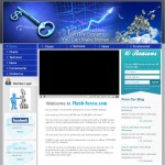

ForexTradersEdge.com Online Marketing Strategy For Craig
Hi Guys,
Its been a while since my last blog post (about two weeks) but I have something very special for you. A client who tracked me down via www.Google.com.au came to me with a question.
His question was – “Mitch, I am just about to launch a really solid product but the mockup my web designer has given me doesnt really look like it will convert and im not sure who to design sites that really convert. What do you think of this mockup?”
So I instantly started to answer him and then thought to myself, the information I am giving him is not only going to help him, but its going to help you, my viewers. So I started recording the skype call to him. You can find it below, but before you start listing to the call. I would recommend downloading the two website mockups so you can see the difference between what his designer suggested for him and what I mocked-up. (Keeping in mind im not a graphic designer, I just know what works.)
Download Craig and Mitch Audio Interview
Craig business has a product side to it and a services side to it;
Product – How to get your head right so that you can get into a trade with confidence.
Service – A trading service so that we can trade for you if you do not have the confidence to trade yourself.
Craig has been trading for a while and has built up a successful track record using a simple system with the most important part of his system, being the psychology because if you are not in the right head space before starting to trade then you will not be successful.
Craig came to me with some mock up images that he felt will not do the job. With no strategy, just passion and a kick-ass product. The recommended strategy I proposed to him is to create a free give away which will create the interest in the viewer so it will immediately draw in clients. He would then do this by creating a valuable freeby (or lead-magnet) which the viewer needs to optin to Craig’s list and is also placed in an auto responder that goes out daily in to the viewer, in a video format (because stats say that video improves conversion by upto 20%! Craig would then create this auto responder series in the format of a 7 day “Master Your Trading Psychology Course” which allows the user to warm up to Craig and his personallity, get an understand of the quality of the product he is selling and makes the user decide if he would like to buy from Craig.
This would not only build a relationship with the potential client but build the brand and create a following. At the end of this there would be a soft up sell to the rest of the book/course. The videos would be uploaded to Youtube, which would also give him more of a market reach and brand exposure by driving traffic to the site from YouTube.
I also talk more about why (logically) I make each change to the mock up of the website and what reasons I do it for. With my main point being: The opt in box needs to be along the right sidebar at the with the navigation bar.
The next important thing to remember when designing a website is that all the important info on your website needs to be above the fold if the website is larger than the single page.
In no way am I paying out web developers/graphic designers. I think that a very important part of web design is to learn how a sales process/sales funnel works in the online world so that web designers can create website for their clients to grow and increase their business, not just make a website that is a testament to the ego of the designer itself. When we create websites for our clients, the first part of the design is about “How can we create something for xyz company so that it increases their revenue” we then create a strategy for them and build the website around the strategy. Not the other way around. Our web design business can be found at http://www.Accedo.com.au
So in summary,
- Opt in box needs to be in the top right
- Call to action needs to be in amongst the copy/sales process area
- Create a video for the site which increases your conversion 10-20%
- Adding Facebook advertising does not bring in huge amounts of traffic but it brings in better qualified leads
- Create a lead magnet which gets your viewers to optin to your list and then create an auto responder to follow them up so that you do not give all you solid content away in one hit.
- Get in front of your viewers (via video or audio or both) as much a possible and give them as many opportunities as possible to interact with you, this builds up the relationship heavily and gets them buying from you. Because you always buy from someone you trust! ![]()
Please feel free to send me a message, facebook friend request or comment on this post if it was helpful to you. I really appricate all the comments I have been getting and of course the warm and welcoming Facebook and Twitter Friend Requests.
FB: http://www.facebook.com/miitchsanders
TW: http://www.twitter.com/mitchsanders
E: mitch (at) TheMarketingDeviant.com
Post Address: http://www.themarketingdeviant.com/internet-marketing-strategies/forextradersedge-com-online-marketing-strategy-for-craig
Facebook comments:
No Comments »
No comments yet.
RSS feed for comments on this post. TrackBack URL
Leave a comment


