
Case Study: An Experiment with Short Form Content
Two days ago I wrote about the power of longer-form content on a blog, and gave a few examples of some posts that I’ve published this year that have been between 4000-7500 words that have done really well.
Today I’d like to talk about an experiment that I’ve been doing in the last week on Digital Photography School with short-form content.
The experiment started as an accident (as many of my better ideas do). I was surfing through some of my favourite Flickr photographers when I came across an image that grabbed my attention.
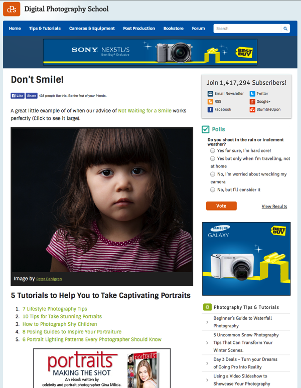
The image was of a portrait of little girl and it grabbed my attention partly because it was a beautiful shot, but also partly because it perfectly illustrated a post that I’d published on dPS recently on how sometimes NOT waiting for your subject to smile is the best time to photograph them.
The image was a creative commons licensed photo, and I toyed with the idea of adding the photo to the original post as an update – but as I pondered it, I wondered if maybe it was an opportunity to do something a little different.
On the spur of the moment I decided to set up a ‘page’ in the back end of WordPress to showcase the image. I added a link to the previously published article and then added a few more links to other portrait photography tips below the image.
Also because the content related to one of our eBooks, I put an ad for one of our eBooks in under the links too.
I also added a Facebook ‘like’ button to the page, and added a Pinterest ‘hover’ button to the image in the hope people might share it.
Here’s how the page looked:
Why I Published it as a Page rather than a Post
You’ll notice that I mention above that I published this image not as a blog post but as a ‘page’ in WordPress.
I did this for a couple of reasons:
Firstly we had already published three posts for the day on the blog and I didn’t want to overwhelm my readers with too much content on the same day.
Secondly this was an experiment – a new type of post that I’ve not done before that was a simple image with a few links. I wanted to test it before rolling this type of post out onto the blog.
How the Content Was Received
I shared the post with our Facebook audience and tweeted the link to it to. As you can see in the screenshot – the post was fairly quickly ‘liked’ on Facebook over 400 times.
The post was liked on the Facebook share a further 300 or so times and was ‘shared’ there a further 36 times.
Traffic to the page was decent. The day I published it on our Facebook page, it received around 4000 visitors. Yesterday it had 250 more. Tonight it will be linked to in our weekly newsletter which should drive some decent traffic to it.
The above stats are pretty spot on average for a typical post on dPS – but what I did notice that was interesting about this piece was that visitors to it went on to view more pages on the site than a typical post.
Hence – the bounce rate on this post was pretty good. A typical post on dPS has a bounce rate of around 70% – but this particle piece of content had a bounce rate of 57%.
The shortness of the post and the fact that it was simply an image, a couple of sentences and some links for further reading meant a lot of people clicked those links and went on to read another 1, 2 or 3 posts on the site.
What I’d inadvertently done with this piece of content was to create a mini-sneeze page (a type of page that propels people deeper into the blog).
I found this fascinating and decided to keep experimenting with this type of post.
Evolving the Experiment
One of the things I immediately wanted to play around with was to change how the post looked.
You can see in the screenshot above that the image itself could only be shown at a relatively narrow size. The content area of our page template on dPS allows for a 600-pixel-wide image.
While this is big enough to illustrate an idea or show a picture in reasonable detail, it lacks punch. I also noticed that the content looks very short against the long sidebar that we had showing on that initial post.
Our sidebar was set up to show subscription options, a poll, ads, recent posts, etc, and while all this looked good on a typical post on the site – on this short piece of content it was two and a half times longer than the content!
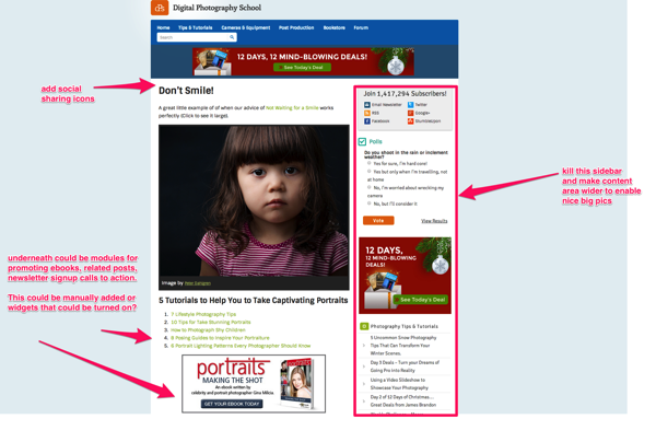
Even as the post was going live on Facebook, I had already begun to talk to our developers to give them instruction on how I’d like to see a new ‘page template’ developed.
I wanted the sidebar removed and also wanted to add built in sharing buttons to replace the little Facebook button that I’d manually added.
Here’s the rough Skitch screenshot that I sent them:
You can see from this that I was already thinking about other possibilities for this type of content. Not only could I use these types of posts to showcase further reading and promote eBooks, but potentially they could be used as pages to get new subscribers to the blog.
While our developer got to work, I began to hunt for a few more ways to use this concept to see if we could test it further.
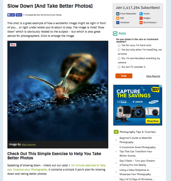
I rolled out my next test piece with a similar format of post – a great image that underneath had a strong call to read a single related post. Here’s how it looked:
This one went up a notch in terms of reader response.
Facebook likes were quickly up over 1000 on the button on the page, the Facebook status update generated over 800 additional likes, 74 shares, and some great comments (including readers submitting their own images), and the page was visited by over 5500 people in the first 24 hours.
While the post only had one link in it to further reading, the bounce rate was down even further to under 50%.
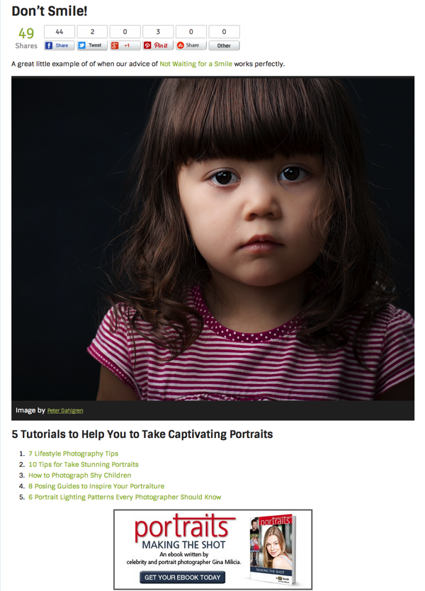
It was around this point that my developers got the page template updated to remove the sidebars and add social sharing buttons.
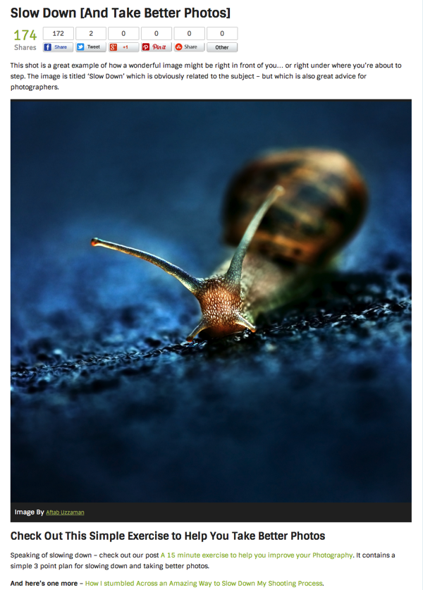
The result of doing so was visually fantastic. Here are the two pages as they look now:
You can see them here and here.
The only pity in the change was that we lost the social sharing numbers that has already been counted with the old Facebook button – but in the scheme of things this was a small price to pay.
Since implementing these changes I’ve created three more of these pages:
- A Great Example of the Zoom Effect (a single image and numerous links for further reading)
- Dreamers: Great Black and White Silhouette Images (a series of four images with further reading)
- Rock Antelope in Golden Light (a single image and six links for further reading)
It is too early to do proper analysis on these posts as tonight we send our weekly newsletter which drives a lot of traffic, but the initial results are promising and in the next couple of days I have a couple more experiments to try using this new approach.
To this point, my initial learnings are that this type of content is great for:
- increasing page views per visit
- showcasing older posts in your archives while still adding new content so that people who’ve seen the old stuff are not just being hit with the same old posts
- creating shareable content (readers seem to be sharing these posts at pretty high rates)
I’ll update you on my next experiments with this type of content in the weeks ahead. To get updated when I do make sure you’re subscribed to our newsletter below:
Originally at: Blog Tips at ProBlogger
Facebook comments:
No Comments »
No comments yet.
RSS feed for comments on this post. TrackBack URL
Leave a comment


