
How I use Google Analytics ‘Compare’ Feature to Motivate Me to Grow My Blog
This morning, a reader asked me this question:
“How do you motivate yourself to grow your blog traffic from day to day?”
We’ve covered a whole heap of techniques for growing the amount of traffic you attract to your blog in our Blog Promotion category (also check out this ‘how to find readers page‘ and listen to my recent finding reader webinar) but one thing that has helped me on the ‘motivation’ front lately is the report below in Google Analytics (click to enlarge).
What you’re looking at is the traffic so far today (the blue line) on Digital Photography School compared to the traffic on the site one week ago (the orange line) – arranged by the hour.
I’ll tell you how to get this report below but first, the reason I love this report is that it tells me whether I’m on track to get as much traffic to my site today as I had this time last week.
Having something to compare traffic keeps me motivated to better the previous week’s result.
Note: I always choose to compare traffic from exactly 1 week previous because on our site we see quite distinct rises and falls in traffic on different days of the week.
In the chart above you can see the day’s traffic started well, with the first 4 hours between 1.7% and 18.1% higher than the previous week.
This all happened while I was asleep so when I checked in at 9am I was pleased! However, I also saw that from 6am-8am that we were beginning to slip behind.
Knowing this gave me a little bit of motivation to find some ways to drive more traffic to the site today.
I took a look at the schedule of Facebook updates that I had planned for the day and decided to move a status update I thought would drive some traffic to be earlier in the day.
That status update went live at 9am and resulted in a nice bump in traffic to get the blue line trending up above the orange again.
I also identified some older posts from my archives that I then scheduled to be tweeted throughout the next 24 hours (based upon my advice from last month to promote old content), which I thought would help us to keep nudging the traffic up higher for the rest of the day.
Having this report open is a great little source of motivation to keep working not only at writing great content but also driving traffic to it.
I also find that having this comparison open during the day (and watching ‘real time’ stats) helps me to spot anomalies in traffic. It helps me to quickly spot if there’s a problem (server issues) or on the flip side it shows me when a post might have been shared on a big blog or social media account.
Knowing this information helps me to react quickly to fix a problem or leverage a traffic event.
UPDATE: here’s how the traffic looked at the end of the day in the comparison view:
Things slipped for the last hour or two but over the full day visitor numbers were up by 4.22%.
While a 4% increase in traffic isn’t the most spectacular result I see it is a small step in a larger race I’m running. I know if I can see even a 1% increase in traffic each week that over a year or longer that it’ll significantly grow the site over time.
How to Get This Report
For those of you new to Google Analytics here’s the easy process to get this report (it will only take you a couple of minutes).
1. Login to your Google Analytics Account
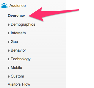
2. In the menu click on the ‘Overview’ link under ‘Audience’
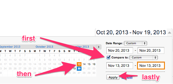
3. By default you’ll be looking at the last months traffic. You want to drill down now to today so in the top right corner click on the date range and a calendar will open up like this:

4. Select today’s date.

5. Check the ‘compare to’ box and then in the new date field that opens up underneath you can put in last weeks date by clicking on the day you want to compare it to. Once you have – click ‘Apply’.
6. You’re almost done now. You should be looking at a report that compares the two days but by default it’ll be showing you the total of the days in the chart as two dots. You want to view this now as ‘hourly’ so hit the ‘hourly’ tab.
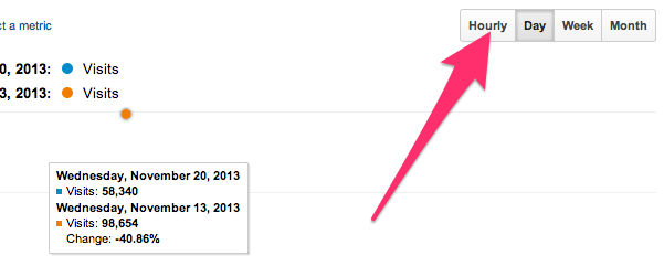
You now should be looking at the comparison of today’s traffic with the same day last week (note: your current days report won’t yet be complete unless the day is almost over and it does run an hour behind).
Variations on this report to check out
This comparison tool is really useful for a while heap of reports.
For example you can choose to compare one week with another:
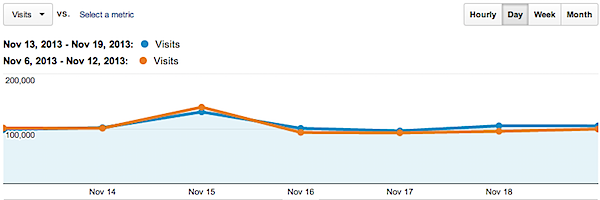
In fact, any period of time can be compared with any other period.
Also, with a date range locked in you can drill down into many other metrics.
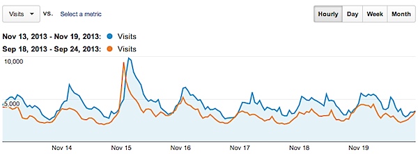
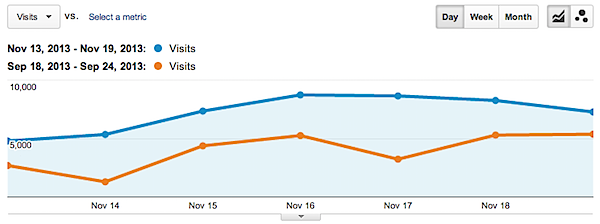
For example, earlier today I was doing some analysis comparing this last week with the corresponding week in September, which was just before we did our new redesign on Digital Photography School.
A day by day comparison showed a great improvement in overall traffic.
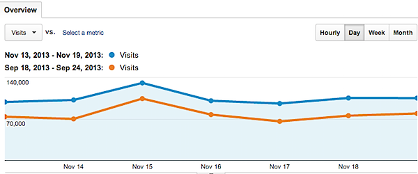
Drilling down further, and viewing the two weeks by the hour, was also fascinating and showed that the two weeks had remarkably similar patterns in traffic from hour to hour – so the increase in traffic was very even across the week.
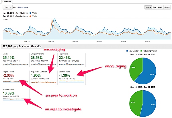
Under that chart was some interesting data:
Not only were Visits and Page views well up – but being able to see that bounce rate was slightly down and that average visitor duration was up was encouraging. Seeing Pages Viewed Per Visit was down showed we have an area to improve on (we’re already working on this) and seeing that we had a good rise in ‘new’ visitors was something that should be investigated further.
To investigate the rise in ‘new’ visitors I moved into the ‘Acquisition’ menu on Google analytics. The same date range and comparison is still selected so now I’m able to compare the two periods when it comes to different sources of traffic and see why we’ve had rises in traffic:
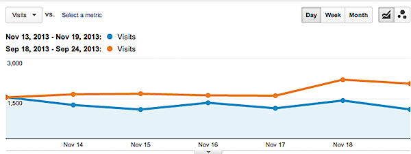
It turns out we’ve seen increases in a few area:
Search Traffic is up:
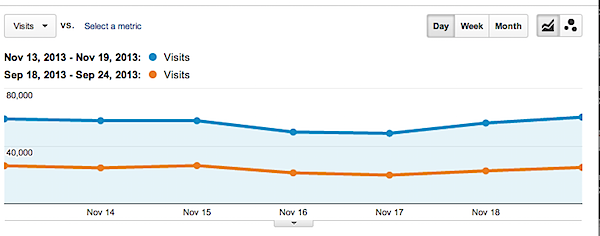
Facebook Traffic is up (due to my recent experiments):
But interestingly Feed traffic is down (giving us something to investigate).
There are many other areas you can drill down into with the comparison tool – almost anything that Google Analytics has a report for you can compare from period to period and get a great overview of how that stat compares very quickly.
Have a go yourself – do some comparisons and let me know what you find in comments below!
Originally at: Blog Tips at ProBlogger
How I use Google Analytics ‘Compare’ Feature to Motivate Me to Grow My Blog
Facebook comments:
No Comments »
No comments yet.
RSS feed for comments on this post. TrackBack URL
Leave a comment


