
The Why and How of Split Testing for Bloggers
This is a guest contribution from Michael Johnston, co-founder of MonetizePros.com.
Split testing has become an absolute must for anyone running an e-commerce site or driving PPC traffic to a landing page. The benefits of disciplined experimentation have been well documented, and any serious e-commerce company has embraced split testing as a surefire way to grow revenue and improve ROI.
But split testing isn’t just for e-commerce sites. It can be a tremendously valuable exercise for websites that don’t have a product to sell or even a landing page to optimize. Bloggers and other publishers are often afterthoughts in split testing discussions and tutorials, but there’s a huge opportunity for this audience to utilize both the user-friendly and more sophisticated split testing apps out there.
If you’re a blogger or publisher looking to improve your website monetization and user experience, we’ll assume that your primary goals look something like this:
- Increase newsletter signups
- Increase pageviews per visit (i.e., decrease bounce rate)
- Increase social shares (Facebook Likes, Tweets, +1s, etc.)
If you have any interest in accomplishing some or all of those goals, there are a number of experiments that you can start running now. Here are 25 of them to get you started:
Nav Bar Testing
Your nav bar is some of the most valuable real estate on your site; it represents an opportunity to steer visitors to the pages you most want them to visit. There are several tests that can be run on the navigation bar to determine the layout that will maximize your conversion rates:
Test #1: Nav Bar Text
Try testing the text you use to describe each of the destinations featured in your nav bar. If you’re featuring a link to your newsletter, try several variations on that concept and see which get the highest and lowest click rates. For example you might try:
- Newsletter
- Free Newsletter
- E-Newsletter
- Subscribe
This experiment can be run for each section / link included in the nav bar; try different phrasings of each until you come up with the top converters.
Test #2: Nav Bar Colors
Changing the colors of the links in your nav bar is another easy-to-run test. This can be especially productive if there’s one nav bar link that you value above all others–a primary section of the site to which you’d like to drive traffic. Try contrasting that link in a number of different colors, and see which results in the highest click rate.
Test #3: Number of Nav Bar Links
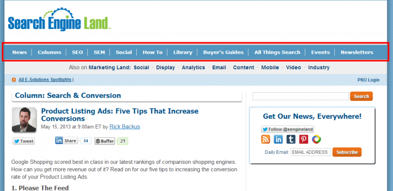
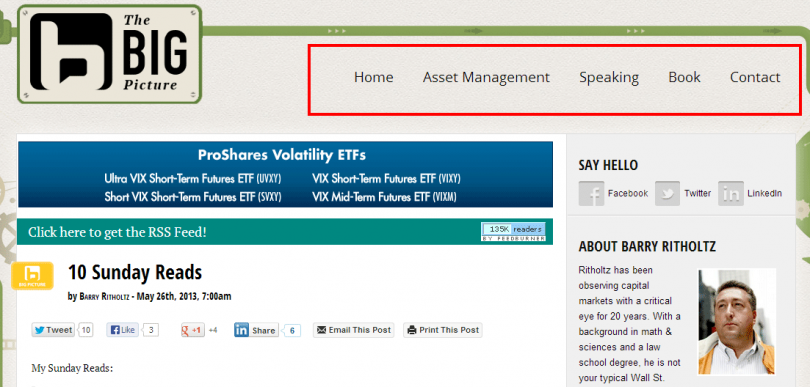
Sometimes in a nav bar, less is more. Try experiments that remove some of the sections of your nav bar and leave only the sections of your site to which you most want to drive traffic. It’s possible that by removing some options you’ll get more total clicks (a result of eliminating the “analysis paralysis”).
Search Engine Land stands out as an example of a site that has a crowded nav bar:
Conversely, the blog at Ritholtz.com features only a few sections of the nav bar:
Newsletter Signups
For most bloggers and publishers, building an email distribution list is one of the most important parts of the audience development process. More email addresses means more recurring traffic, more regular readers, and more visibility for your content.
Converting a visitor who lands on your site to a newsletter subscriber is a huge win, and many websites devote prime real estate to an email capture mechanism. Here are some tests you can run to figure out the optimal layout for converting visitors from search or referring domains to newsletter subscribers:
Test #4: Signup Box Placement
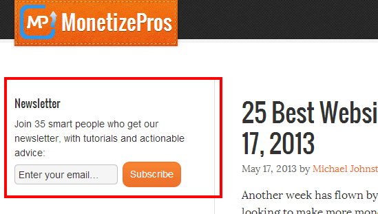
Many publishers drive newsletter subscriptions through a widget in the sidebar of their sites. In most cases, a significant percentage of all signups comes from this placement.
Experiment with where this box goes on your site, or for an advanced implementation make it “follow” your readers as they scroll down the page.
Test #5: Newsletter Signup Box Copy
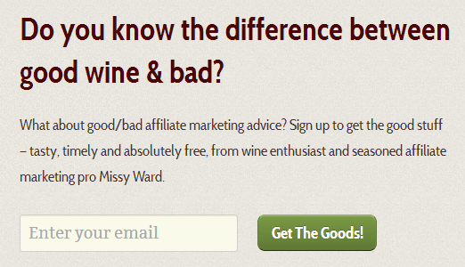
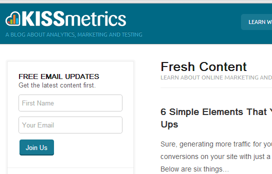
The copy that accompanies your newsletter signup widget can impact your conversion rate. Try different calls to action to see what grabs readers’ attention and prompts them to enter their email address. Variations can be plain vanilla (“Sign up today for our free email newsletter”) or more bold (“Get the best [niche] content delivered to your inbox”). Come up with 3-5 different variations and see which performs best.
Here’s an example from MissyWard.com:
And here’s one from the KISSmetrics blog:
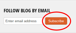
Test #6: Subscribe Button Color
The color of the button that seals the deal for newsletter signups is probably an afterthought for most bloggers. This is one of the easiest tests to run; pick a few different color patterns for the “Subscribe” button and see if any stand out at attracting attention from visitors.
You’ll notice that a lot of newsletter signups feature an orange Subscribe button; that color is known to generate positive feelings:
In their e-book on Conversion Centered Design, Unbounce notes the emotions associated with certain colors:
- Red: danger, stop, negative, excitement, hot
- Dark blue: stable, calming, trustworthy, mature
- Light blue: youthful, masculine, cool
- Green: growth, positive, organic, go, comforting
- White: pure, clean, honest
- Black: serious, heavy, death
- Gray: integrity, neutral, cool, mature
- Brown: wholesome, organic, unpretentious
- Yellow: emotional, positive, caution
- Gold: conservative, stable, elegant
- Orange: emotional, positive, organic
- Purple: youthful, contemporary, royal
- Pink: youthful, feminine, warm
- Pastels: youthful, soft, feminine, sensitive
- Metallics: elegant, lasting, wealthy
Test #7: In-Content Newsletter Plugs
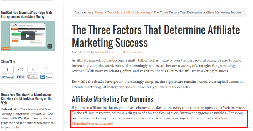
One of the best places to create new newsletter subscribers is within your content. While readers are digesting your content, they’re ripe for the suggestion of joining a mailing list that will provide them with more of the same. Here’s an example of one of our in-content plugs for our mailing list:
Test out different implementations of this to see what combination delivers. Items to vary include the copy, position within content, and even the color / font.
Test #8: Newsletter Page Copy
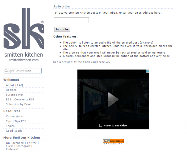
In addition to a sidebar widget to capture emails, most blogs include a page dedicated to the newsletter sign up process. Try different copy on your newsletter signup page above the fields that will actually be filled out to subscribe. Variations to test may include:
- Bullet points highlighting the benefits of signing up (the number and content of each can vary)
- One sentence call to action (“Enter your email address below to sign up for our free e-newsletter”)
- Pledge to not spam
- No copy at all (simply a signup box)
There is a ton to test here, including location of subscribe box, color of the button, number of bullet points, copy of the bullet points, etc.
Test #9: Newsletter Page Ads
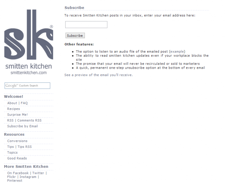
The screenshot above highlights another testing opportunity: try removing all ads from your newsletter signup page, and measure the impact on your conversion rate. In all likelihood, you’ll see an increase in signups; the page will load more quickly, and there will be fewer distractions for potential subscribers.
You’ll forego some revenue from deleting ad units, but may make up for it with increased newsletter conversions. So the variation might look something like this:
Test #10: Required Fields
If your site requires multiple fields to be completed in order to complete a newsletter signup or other registration (such as a free membership), there’s an opportunity to test the impact of changing the number of inputs required.
Here’s a site that requires first name and email address in order to get a copy of an e-book:
An obvious test to run here would be to remove the “First Name” field and measure the change in conversion rate with only one required input.
Test #11: Thank You / Confirmation Page
Once a visitor has completed the newsletter signup process, there’s still more you can prompt them to do. The “thank you” page that confirms a newsletter signup is often overlooked, but is a great place to test strategies to funnel new subscribers back into your content (i.e., lower the exit rate from that page).
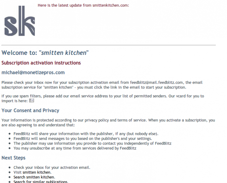
To demonstrate, we’ll stick with the Smitten Kitchen example from above. Here’s where I land after signing up for the newsletter:
I would guess that the exit rate from this page is pretty high; there is no clear call to action, and the link that directs you back to the site is hidden near the bottom of the page. There’s a great opportunity to do some testing here to pull new subscribers back to the site–a section with popular posts (including images) could be a place to start.
Joseph Kerschbaum put together a great article on this concept that includes some specific examples.
Test #12: Social Proof / Testimonials
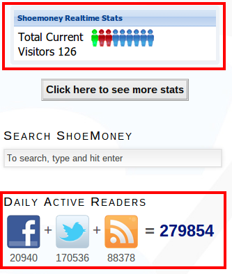
In order to convince visitors to sign up for your newsletter or create an account, it may be helpful to use the testimonials of others. There are two primary ways to reflect your site in a positive light: volume and quality. Volume simply means using numbers to show how popular your newsletter is.
Here’s an example from ShoeMoney.com:
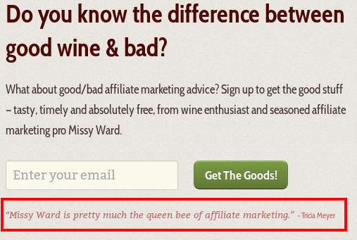
Earlier we showed the newsletter signup at MissyWard.com, which includes a testimonial to enhance the perceived value of signing up for the free newsletter:
Test both of these methods for boosting the perception of your newsletter, and evaluate the impact it has on conversion rates.
Social Sharing
Increasing the social sharing of your site will lead to more pageviews, incoming links, and overall recognition of your brand and content. Here are some tests to run to determine the set-up that leads to maximum Tweets, Likes, and +1s:
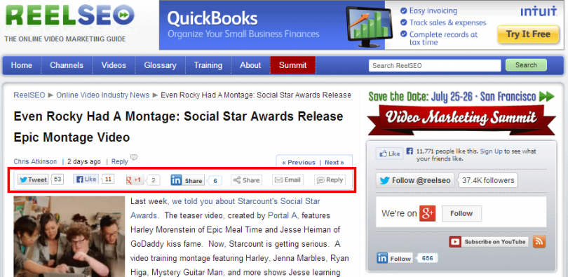
Test #13: Social Share Positioning
Where on the site are readers able to share your content socially? The share buttons can live just about anywhere on the page, and you should be sure to know the impact that each position has. For example, here’s a site that positions them at the beginning of an article:
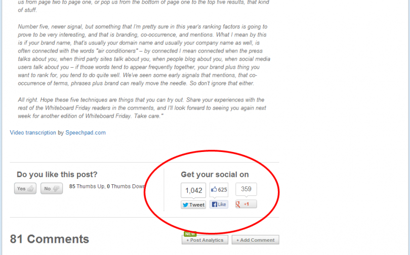
Here’s one (SEOmoz.org) that has them at the end:
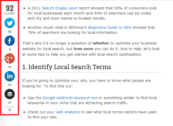
And here’s one that uses an increasingly popular floating left sidebar implementation:
If you want to increase social sharing of your content, test different positions of your sharing widgets to see which locations result in the highest level of visitor engagement.
Test #14 Social Share Implementation
In addition to testing where social share buttons should appear, publishers can experiment with the look and feel. Here are three different examples to try:
Example #1:
Example #2:
Example #3:
Content-Related Tests
The way you lay out your articles or blog posts will have a big impact on how many pages the average visitor to your site views. By testing various implementations around your content, you can uncover the settings that will make your site “sticky” and generate more pageviews per visit.
Test #15: Featured Content
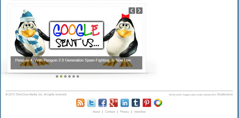
Many sites highlight their best content in a “Featured Articles” or “Most Popular” section. ReelSEO has a slick widget for highlighting different types of content:
Driving higher engagement with Featured Content boosts time on site, pageviews per visit, and ultimately revenue. This is another great testing opportunity: rotate in different features, images, and positioning to this section and see which settings result in the most clicks.
Test #16: Images For Featured Content
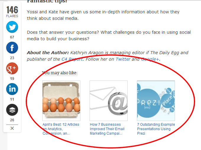
When trying to draw your visitors’ attention to certain parts of your site, images can be a powerful tool to capture and guide the eye. Text is easily overlooked and ignored, whereas pictures tend to prompt an immediate response and may be more likely to generate clicks. Note the bottom of articles at the Crazy Egg blog:
Test #17: Sidebar Ordering
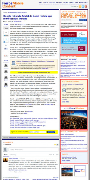
The sidebar–either left or right of content–is often used by publishers and bloggers to promote different services (such as newsletters or social media accounts) and sections of the site (such as specific pieces of content or content categories). Here’s an example that includes 1) newsletter signup 2) advertisements 3) popular stories 4) e-book 5) another e-book 6) more articles 7) upcoming events.
There’s a big opportunity to test the order of these offerings.
Test #18: Breadcrumbs
Breadcrumbs are often used to orient your visitors on your site, and can also be tools for helping them discover additional content and features on your site.
Several aspects of breadcrumbs can be tested to drive engagement, from the structure to the font and colors. The Crazy Egg Blog uses a unique color scheme to draw attention:
Here’s the more detailed breadcrumb we use on our site:
And here’s one more example:
Best of the Rest
There are a number of other areas that can be used to steer visitors to the parts of your site that you particularly want them to visit (e.g., newsletter or membership signups, or your best content). Here are a handful more tests bloggers and publishers can run to get their funnels optimized.
Test #19: Footer
Not a lot of thought goes into the footer of a website, but this section represents another opportunity to funnel visitors to the stickiest and best parts of your site. There are lots of opportunities to test here, but perhaps a good starting point involves two very different strategies.
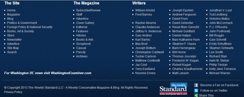
Here’s a footer that effectively functions as a sitemap, featuring links to just about every section of the site:
Here’s a much slimmer implementation that includes only a small number of pages:
There are some obvious extensions of this testing; you can try different layouts, copy, and color schemes as well.
Test #20: Search Box
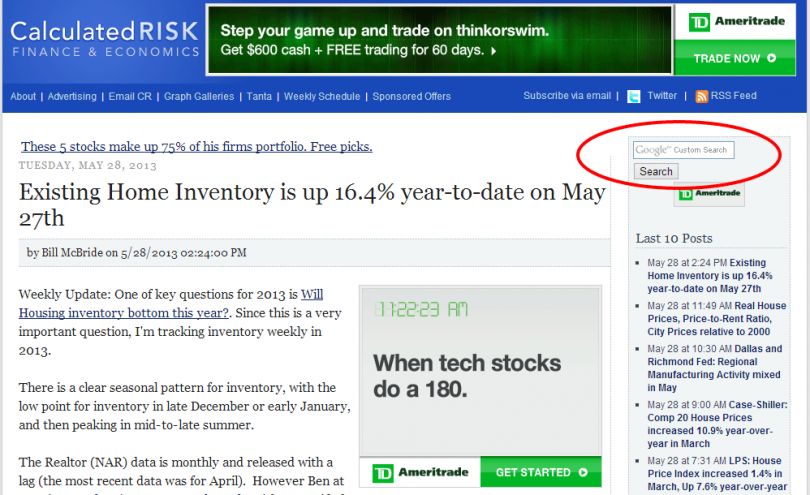
Search boxes can help your visitors find exactly what they’re looking for, which makes your site stickier and more useful to them. If you want to drive higher engagement here, try changing the color of the search button and the location of the search box. Move it within the sidebar or try re-positioning above the fold and integrating it into the leaderboard:
Test #21: Wide Stripe
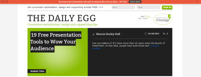
We’ve seen some cool implementations of a page wide stripe to promote newsletter subscriptions, free trials, or other actions. Here’s an example from the Crazy Egg blog:
This can be a great way to funnel visitors towards a specific objective, and there are obviously plenty of testing opportunities here as well. Try changing the call to action and color for starters, and monitor the impact on click rates.
Test #22: Pop-Ups
The pop-up offer is one of the most effective tools available for boosting newsletter subscription rates, They’re annoying, but they work. There are all sorts of variables that can be tested within the pop-up itself, from the color scheme to the offer to the copy used to capture email addresses:
Test #23: Post-Article Membership Offer
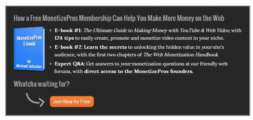
The real estate at the end of articles / blog posts can be a great opportunity to drive your readers deeper into your funnel. For example, here’s the call to action we include after the conclusion of each article that prompts readers to sign up for a free membership:
Obviously, there’s lots to test here; the copy used, number of lines of copy, color of the e-book cover, color scheme, etc.. If you have a call to action below your content, test out different combinations to see hat drives conversions.
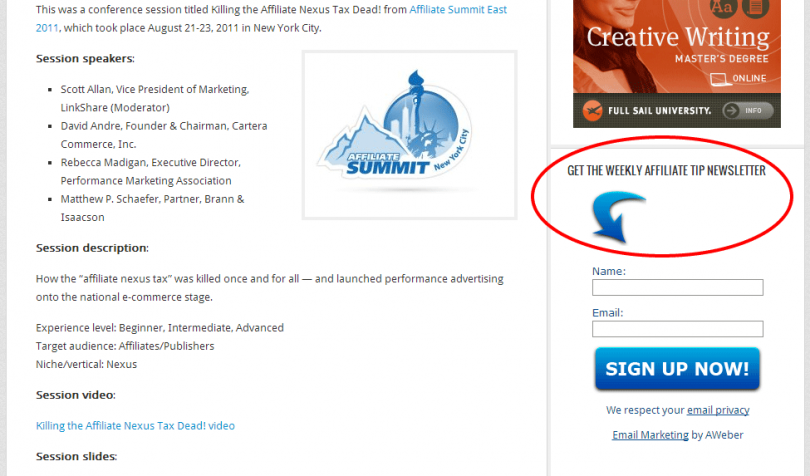
Test #24: Arrows
In a recent e-book on conversion centered design, Oli Gardner from Unbounce sums up the effectiveness of arrows as tools to help drive visitors to the desired sections of your site:
As directional cues, arrows are about as subtle as a punch in the face, which is why they work so well. With so little time on your page, visually guiding the user to the checkout is a smart move.
Here’s an example from AffiliateTip.com, a popular affiliate marketing blog:
We’ve also experimented with arrows on pages that drive signups to our free memberships (with pretty good results):
Try incorporating arrows into pages or sections of your site where visitors are able to sign up for your newsletter or create a membership. Evaluate the impact this visual cue has on conversions, and test variations of the implementation (e.g., style, colors) if the results are encouraging.
Test #25: Author Bios
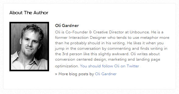
Once visitors have read an article or blog post on your site, there’s a great opportunity to present them with an offer to engage with or follow the author. This is especially true if you reinforce the authority of the writer with an impressive biography–and then serve up an easy opportunity to follow on Twitter (or other social platforms).
Here’s an example from Unbounce. Notice the prompt to follow the author on Twitter:
Here’s another example from ReelSEO:
And one from ESPN.com:
Try implementing an author bio section at the end of your posts (even if there’s just one author) and include an option for readers to follow you on Twitter and/or get your posts via email (i.e., sign up for your newsletter). Throw together a headshot, brief bio, and call to action and measure the impact on conversion rate through this placement. Once implemented, there are obvious opportunities to test effectiveness through tweaks to image, headline font, color scheme, etc.
Bottom Line
While most cases for split testing are geared toward e-commerce companies, this exercise can be a tremendously valuable one for bloggers and publishers as well. Conducting split tests across your site can help you boost newsletter conversion rates, increase social sharing and pageviews per visit, and generally make more money from your existing traffic.
Take advantage of the numerous resources out there for split testing, and start optimizing your site today.
Michael Johnston is a co-founder of MonetizePros.com, a resource devoted to helping publishers and bloggers make more money from their existing Web traffic.
Originally at: Blog Tips at ProBlogger
Facebook comments:
No Comments »
No comments yet.
RSS feed for comments on this post. TrackBack URL
Leave a comment


